Dark Mode Bauhaus
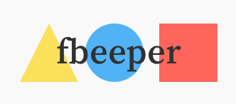
On May 17th, 2020 ~ 2 min readWhen building this site I went for a minimalistic design. Inspired by Medium, an ornamented serif font helps make it feel less technical. The otherwise plain design keeps it modern. And to make it more personal, I added some bright colored geometrical decorations.
They are a homage to the hallmark of Bauhaus design:
Without getting into detail, Wassily Kandinsky, who taught at the Bauhaus, studied shapes and color and theorized about their properties and relationships. Each color and shape was associated with some psychological properties and got inherently connected. From these studies arose the well known yellow triangle, blue circle, and red square of the Bauhaus. Modern studies deem Kandinsky’s findings not too accurate. Still, having tested myself, my choices coincided with Kandinsky’s model. It does not make it correct, but it is serendipitous.
I feel this Bauhaus choice sharply (but beautifully) contrasts with the serif font that is not associated at all with the Bauhaus design. After all, are living an era of remixes.
Accessible Color
Now, combining my initial color picks with the existing text was not going to be a recipe for success. I cared about providing solid readability in every scenario. So, I had to ensure proper color contrast of the text over the graphics.

Sample of my initial out-of-context color choices.
The text is not easy to read.
From here, the closest colors that would satisfy legible contrast ratios did not work for me. So I kept tuning them until they did. That is, I liked the individual colors, they worked together, they had a 4.5+ contrast ratio with my font color, and they looked good on the site.

My light mode color choices (with proper contrast.)
Dark Mode
To support dark mode, I had to play a game with more variables. The colors for the light background did not match the new dark environment even when having a theoretically correct contrast. Dark mode colors need a different luminosity to be easy on the eye:

My dark mode color choices.
None of this is novel or mindblowing, but I felt it was a short and sweet sample to share what is behind the scenes when designing for accessibility and dark mode.
–